Legend explained
Emoticons on the map represent the locations of air quality monitoring stations. The color corresponds to the air quality index at the given hour at that station. Note that it does not reflect the annual average measured at the air quality situation which may differ significantly.
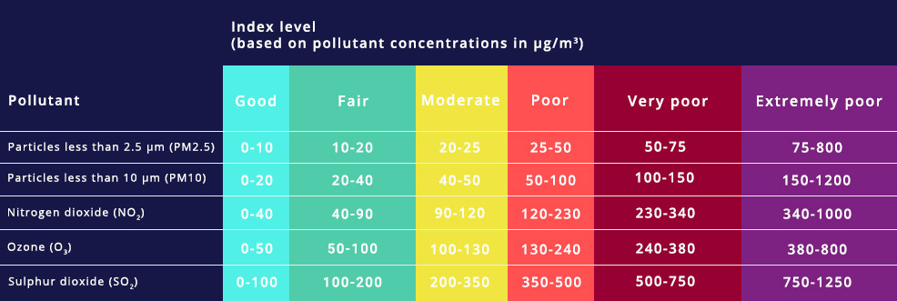
Measurements of up to five key pollutants supported by modelled data determine the index level that describes the current air quality situation at each monitoring station. The index corresponds to the poorest level for any of five pollutants according to the following scheme.
The grey color indicates stations for which no data have been reported.


